Friday, October 30, 2015
Thursday, October 15, 2015
Friday, October 9, 2015
House Prices Compared
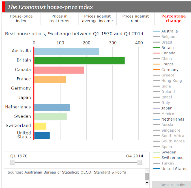
The Economist has put up an interactive graphic on house prices that allows us to compare house prices, prices against average income, prices against rents and percentage changes.
The house price index allows us to choose a starting point going back as far as 1970 to look at changes in house prices. In an index the starting point is given a value of 100. If we go back to 1970, house prices have risen to over 9000 on the Index for South Africa and nearly 5600 in Britain and nearly 4000 in Australia. The United States, Germany and Japan's rises have been much less significant, with Japan suffering massive falls after the rises in the 1980s.
A better indication of real changes is provided as well, which makes the changes slightly more palatable. On this basis South Africa's rises in nominal terms bounce back to reality and Britain is the stand out performer with Australia also steadily rising. In real terms, prices in Japan and Germany are roughly at the same level as they were in 1970.
If we compare this same set of countries over the past 10 years, then Sweden and Canada are the stand outs.
Comparing house prices against average income gives us a measure of how affordable house prices are. If average incomes have been increasing rapidly it would be surprising if house prices didn't increase rapidly as well. But what we see if we play with countries and dates is that houses have become significantly less affordable (overvalued) in Australia and Canada. Indeed, Australia is the standout. Japan's houses are significantly undervalued compared to the long term average of the ratio of prices to income.
Comparing house prices to rents gives us another variable to compare value. On this basis we get similar results, although Canada is now the stand out of overvaluation.
Playing with the starting date provides some interesting comparisons: Australia, Germany and Japan for example. Germany is particularly interesting for its relative stability. Ireland has had a spectacular rise and fall and is now rising again.
The two variables that seem to indicate that Australian housing on average is overpriced are prices against income and prices against rent. Both have veered significantly from their long-term averages.
THE Economist tracks the health of housing in 26 markets around the world, encompassing a population of over 3 billion. Prices are now rising in 21 of these markets at a median pace of 4.7% a year. China’s housing market is one of only five countries in our index where prices are falling, joining Singapore and a trio of euro-zone countries—France, Greece and Italy. The government has been trying to boost the market over the past ten months which is now slowly responding.
To assess whether house prices are at sustainable levels, we use two yardsticks. One is affordability, measured by the ratio of prices to income per person after tax. The other is the case for investing in housing, based on the ratio of house prices to rents, much as stockmarket investors look at the ratio of equity prices to earnings. If these gauges are higher than their historical averages then property is deemed overvalued; if they are lower, it is undervalued. According to our measure, property is more than 30% overvalued in six of the markets we track, notably in Australia, Britain and Canada.By comparing particular subsets of the list of countries it allows us to contextualise Australia's experience over the last 40 years.
The house price index allows us to choose a starting point going back as far as 1970 to look at changes in house prices. In an index the starting point is given a value of 100. If we go back to 1970, house prices have risen to over 9000 on the Index for South Africa and nearly 5600 in Britain and nearly 4000 in Australia. The United States, Germany and Japan's rises have been much less significant, with Japan suffering massive falls after the rises in the 1980s.
A better indication of real changes is provided as well, which makes the changes slightly more palatable. On this basis South Africa's rises in nominal terms bounce back to reality and Britain is the stand out performer with Australia also steadily rising. In real terms, prices in Japan and Germany are roughly at the same level as they were in 1970.
If we compare this same set of countries over the past 10 years, then Sweden and Canada are the stand outs.
Comparing house prices against average income gives us a measure of how affordable house prices are. If average incomes have been increasing rapidly it would be surprising if house prices didn't increase rapidly as well. But what we see if we play with countries and dates is that houses have become significantly less affordable (overvalued) in Australia and Canada. Indeed, Australia is the standout. Japan's houses are significantly undervalued compared to the long term average of the ratio of prices to income.
Playing with the starting date provides some interesting comparisons: Australia, Germany and Japan for example. Germany is particularly interesting for its relative stability. Ireland has had a spectacular rise and fall and is now rising again.
If we make the starting date 2007we can see how well Australia has done in comparison with many other countries, although German house prices have risen as well. Greece is a fairly bleak story.
So what does it all mean? It means that house prices nearly everywhere have had periods of significant expansion due to increasing access to credit and greater financialisation of economies. While these are global occurrences, particular national considerations are have also been at play including regulations and incentives that encourage house speculation, such as restrictions on housing supply and negative gearing in Australia.
According to the RBA:
Over the past 30 years, Australian housing prices have increased on average by 7¼ per cent per year, and over the inflation-targeting period by around 7 per cent per year. However, these averages mask three distinct phases:The RBA contends that "housing price growth was closely associated with changes in the debt-to-income ratio over most of the 1990s until the mid 2000s". Recent rises have been closely associated with the increased role of investors.
- During the 1980s, annual housing price inflation was high, at nearly 10 per cent on average, but so too was general price inflation. In real terms, housing price inflation during the 1980s was relatively low, at1.4 per cent per annum compared with 4.5 per cent during the period from 1990 to the mid 2000s, and 2.5 per cent over the past decade.
- The 1990s until the mid 2000s were marked by quite high housing price inflation, of 7.2 per cent per annum, on average, in nominal terms.
- Annual nominal housing price inflation over the past decade was lower than either of these periods, at a little over 5 per cent on average.
The two variables that seem to indicate that Australian housing on average is overpriced are prices against income and prices against rent. Both have veered significantly from their long-term averages.
Subscribe to:
Comments (Atom)


