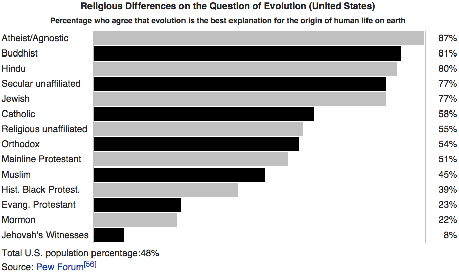
While atheism is growing in the US, most Americans wouldn't vote for one. At least most of them believe in evolution.
All graphs from Max Roser on Twitter.


All graphs from Max Roser on Twitter.

Income growth in emerging nations has produced huge gains in human welfare, lifting hundreds of millions of people out of desperate poverty and giving them a chance for a better life.Max Roser shows world income distribution in the years 1820, 1970 and 2000.


Just 100,468 locally-made Holdens, Fords and Toyotas were sold in 2014; the last time the tally was this low was in 1953 when 99,133 vehicles were made in Australia, according to a historical Manufacturing Industries report prepared by the Australian Bureau of Statistics.
The same report shows, at its peak, the Australian car manufacturing industry produced 473,045 vehicles in 1976. Between 1968 and 1985 the annual average number of vehicles produced locally exceeded 400,000. However, the Australian car manufacturing industry has been in free fall since the most recent peak of 344,000 vehicles were produced locally just seven years ago, in 2007.
In 1960, more than 90 per cent of cars sold in Australia were made locally. In 2005, locally made vehicles accounted for one in four (25 per cent) of all new cars sold. In 2014, less than one in 10 cars (or 9 per cent) was built locally.We really are in the final stages of managed decline!


.jpg)
.gif)
.gif)
.gif)
.gif)
.gif)
.gif)
.gif)
.gif)
.gif)


.gif)
.jpg)
.gif)
.jpg)
.gif)
.jpg)
.gif)
.jpg)
.gif)
.jpg)
.gif)
.jpg)
.gif)
.jpg)
.jpg)
.gif)
.gif)
.gif)
.gif)
.gif)
.gif)
.gif)
.gif)
.gif)
.gif)
.gif)
.gif)
.gif)
.gif)
.gif)
.gif)
.gif)
.gif)
.gif)
.gif)
.gif)
.gif)
.gif)
.gif)
.gif)
.gif)
.gif)
.gif)
.gif)

