How we measure economies matters. To get a clearer picture of the world economy we need to look not only at size, but wealth, development and distribution. But even when measuring the size and wealth of economies, the method of measurement we choose will have a big impact on the outcome. On some measures the Chinese economy is due to overtake the US economy before the end of the decade, while on others it will take much longer. Looking at other measures it is clear that while China might be approaching the US in size, it still has a long way to go to match it in terms of per capita GDP and overall development.
Every 6 months, the IMF releases statistics for all the countries that make up the world economy. These statistics provide an opportunity to compare countries at a number of levels, in a way that provides some indication of past performance, current predicaments and future possibilities.
There are two ways to measure the size of economies. Firstly, we can convert the value of a country's gross domestic product (GDP) into US dollars and compare it to the GDP of other countries whose currencies have been converted into US Dollars also.
The advantage of this method is that it provides a neat comparison of a particular country with any other country at any particular time. Its shortcoming, however, is that it varies with the US dollar (USD) exchange rate with particular countries and doesn’t accurately reflect the cost of things within them. If a currency appreciates or depreciates (or equivalently) the USD depreciates or appreciates, the size of the economy will change.
If, for example, the renminbi was revalued (or appreciates) against the USD this would immediately increase the measured size of the Chinese economy in USD terms.
This shortcoming does not make USD-based measures completely spurious because in this example a higher valued renminbi would enable Chinese people and companies to buy more goods and services on the international market for a given amount of renminbi. It would also increase the purchasing power of the renminbi in terms of foreign investment. US companies, for example, would become relatively cheaper for Chinese investors.
When exchange rates do vary considerably over time, such as the dollar–yen exchange rate after the 1970s, this method may cause distorted measures of size. This is also relevant for the Australian economy. For example, compare the difference in 'size' of the Australian economy when measured at the time the Australian dollar was worth around 50 US cents in the early 2000s and when measured in more recent years when it has been mostly above parity. Although for measuring purposes the exchange rate is averaged over a period, exchange rate variation still poses significant problems.
Such discrepancies have led to the increased use of an alternative method of measuring the size of economies based on the concept of purchasing power parity (PPP). Statisticians measure purchasing power within individual economies and then make comparisons on that basis. PPP measures GDP adjusted to reflect different costs of living and production within different economies. As most travellers know, goods and services and production costs are considerably lower in some countries than they are in others.
We all know that the Australian dollar goes further in some countries and buys less in others. You can live, for example, much more cheaply on Australian dollars in Indonesia than you can in Sweden. A popular representation of PPP values is the Economist magazine’s tongue-in-cheek Big Mac Index, which compares the price of Big Macs around the world. A Big Mac in Sweden will cost you a lot more than a Big Mac in Indonesia or even the United States itself on US dollar adjusted terms in relation to a country's exchange rate.
According to PPP theory, the cost of Big Macs should be the same across countries once local currencies are converted to US dollars. Big Macs, however, are not really a good marker of PPP because they are generally considerably more expensive than local-food items in developing countries. This is why the World Bank constructs data using Geary-Khamis dollars, commonly referred to as international dollars as a basis for comparison.
If we compare what a given amount of dollars will buy in the Chinese economy and compare it to what a given amount of dollars buys in the US economy we can, according to advocates of this approach, get a better idea of the true size of the Chinese economy.
The problem with this method is calculating the different costs of production and living on an ongoing basis. To do a proper analysis of PPP, the World Bank compares a large range of goods and services. It is, however, very difficult to get a comparable basket of goods and services for diverse countries with diverse cultures and consumption habits.

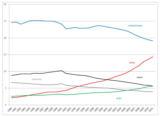
The data are ranked according to the estimates for 2011. The IMF lists, the latest year for which data is actual rather than an estimate, which is 2010 for most countries (2009 for the US). What this shows is a trend decline for the United States, Japan and Germany, and a trend rise in share for China and India.
Remember that these are relative shares, so that the US economy has not actually gotten smaller over this period. Instead the faster growth of China and India and the recent recession and slow recovery of the United States and Europe has helped them to increase their shares.
On a PPP basis, Australia's share of global GDP has remained remarkably static declining from 1.3% of the world economy in 1980 to 1.2% in 2011. The Indonesian economy is now the 15th largest economy, passing Australia in size in the late 2000s.
The USD based measurements give a remarkably different picture, the most striking of which is the fact that China is less than half the size of the US economy on USD terms, while it is three-quarters of the US economy under PPP calculations. While China became bigger than Japan in the early 2000s on a PPP basis, it only surpassed Japan on a USD basis in the late 2000s.
On a USD basis, the Australian economy accounts for a much higher share at 2.1% of the total, compared to 1.2% on a PPP basis. Once again this has much to do with the fact that the Australian dollar is now worth considerably more than it was in 2000!

In 1985, due to the high value of the USD in comparison with other major currencies, the US reached 35% of world GDP, falling to 29.4% in 1987, by which time the USD had substantially declined in value against other major currencies. The same thing happened in the early 2000s as capital flowed into the United States and the exchnage rate rose. Recent years have seen a significant depreciation of the USD, which has enhanced the fall in the US share of the world economy on a USD basis.
While India is the world's third largest economy on a PPP basis, it is only the world's eleventh largest economy on a USD basis. Australia is also considerably larger than the Indonesian economy on a USD basis (2.1% compared to 1.2%). On a USD exchange basis, the Australian economy is nearly the same size as India's economy.

When we compare the United States, Japan, China and India on a PPP versus USD basis, we can see how significant the method of measurement becomes. Simply, the USD exchange method favours the richer countries and PPP favours the developing countries.
USD v PPP Share of Global GDP, Selected Countries


GDP Per Capita USD, Selected Years

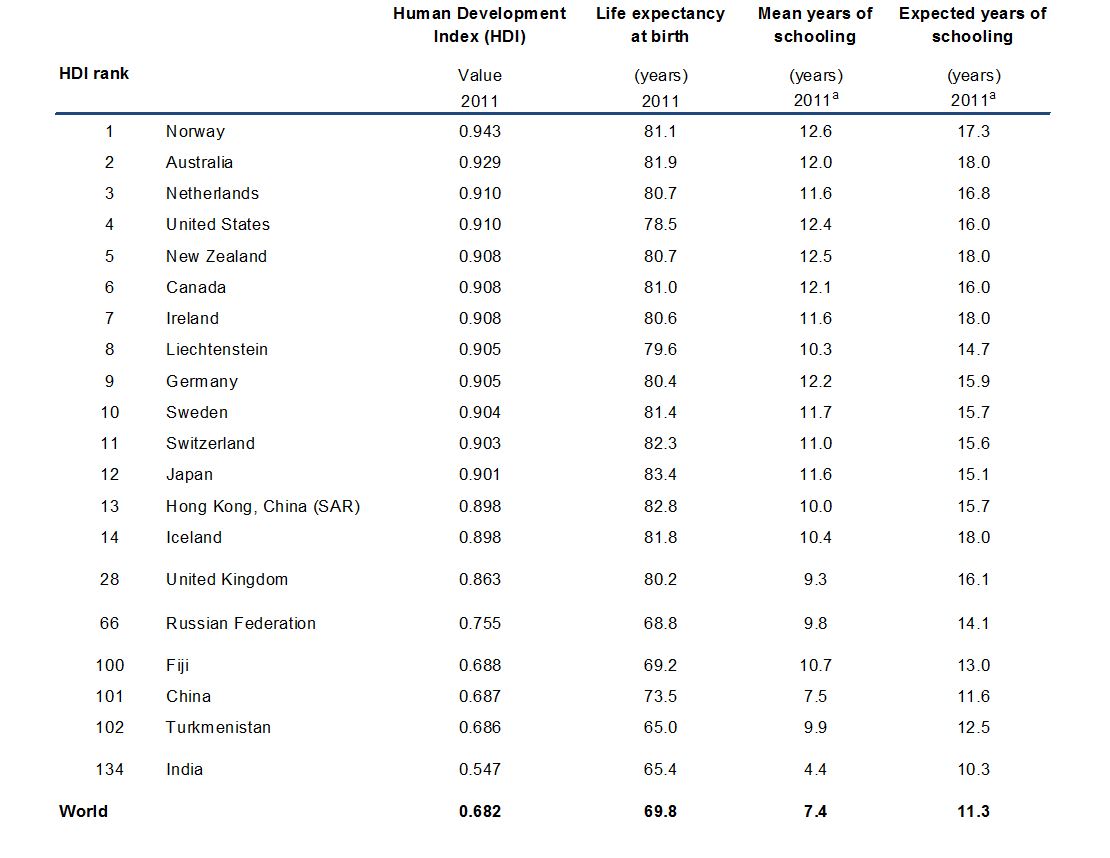
Another pertinent measure that helps us to gauge aggregate development rather than simply aggregate economic growth is the United Nations Development Program’s Human Development Index (HDI). The HDI attempts to provide a broader measure of progress than GDP by including life expectancy, literacy, education and GDP per capita.

The next table shows three of the components of the HDI - life expectancy at birth, mean and expected years of schooling. The HDI also includes GDP per capita, which we have shown above.


Every 6 months, the IMF releases statistics for all the countries that make up the world economy. These statistics provide an opportunity to compare countries at a number of levels, in a way that provides some indication of past performance, current predicaments and future possibilities.
There are two ways to measure the size of economies. Firstly, we can convert the value of a country's gross domestic product (GDP) into US dollars and compare it to the GDP of other countries whose currencies have been converted into US Dollars also.
The advantage of this method is that it provides a neat comparison of a particular country with any other country at any particular time. Its shortcoming, however, is that it varies with the US dollar (USD) exchange rate with particular countries and doesn’t accurately reflect the cost of things within them. If a currency appreciates or depreciates (or equivalently) the USD depreciates or appreciates, the size of the economy will change.
If, for example, the renminbi was revalued (or appreciates) against the USD this would immediately increase the measured size of the Chinese economy in USD terms.
This shortcoming does not make USD-based measures completely spurious because in this example a higher valued renminbi would enable Chinese people and companies to buy more goods and services on the international market for a given amount of renminbi. It would also increase the purchasing power of the renminbi in terms of foreign investment. US companies, for example, would become relatively cheaper for Chinese investors.
When exchange rates do vary considerably over time, such as the dollar–yen exchange rate after the 1970s, this method may cause distorted measures of size. This is also relevant for the Australian economy. For example, compare the difference in 'size' of the Australian economy when measured at the time the Australian dollar was worth around 50 US cents in the early 2000s and when measured in more recent years when it has been mostly above parity. Although for measuring purposes the exchange rate is averaged over a period, exchange rate variation still poses significant problems.
Such discrepancies have led to the increased use of an alternative method of measuring the size of economies based on the concept of purchasing power parity (PPP). Statisticians measure purchasing power within individual economies and then make comparisons on that basis. PPP measures GDP adjusted to reflect different costs of living and production within different economies. As most travellers know, goods and services and production costs are considerably lower in some countries than they are in others.
We all know that the Australian dollar goes further in some countries and buys less in others. You can live, for example, much more cheaply on Australian dollars in Indonesia than you can in Sweden. A popular representation of PPP values is the Economist magazine’s tongue-in-cheek Big Mac Index, which compares the price of Big Macs around the world. A Big Mac in Sweden will cost you a lot more than a Big Mac in Indonesia or even the United States itself on US dollar adjusted terms in relation to a country's exchange rate.
According to PPP theory, the cost of Big Macs should be the same across countries once local currencies are converted to US dollars. Big Macs, however, are not really a good marker of PPP because they are generally considerably more expensive than local-food items in developing countries. This is why the World Bank constructs data using Geary-Khamis dollars, commonly referred to as international dollars as a basis for comparison.
If we compare what a given amount of dollars will buy in the Chinese economy and compare it to what a given amount of dollars buys in the US economy we can, according to advocates of this approach, get a better idea of the true size of the Chinese economy.
The problem with this method is calculating the different costs of production and living on an ongoing basis. To do a proper analysis of PPP, the World Bank compares a large range of goods and services. It is, however, very difficult to get a comparable basket of goods and services for diverse countries with diverse cultures and consumption habits.
The International Comparison Program (ICP) is a worldwide statistical partnership to collect comparative price data and compile detailed expenditure values of countries’ gross domestic products (GDP), and to estimate purchasing power parities (PPPs) of the world’s economies. Using PPPs instead of market exchange rates to convert currencies makes it possible to compare the output of economies and the welfare of their inhabitants in real terms (that is, controlling for differences in price levels).We begin by considering the share of global GDP for the major economies on a PPP basis.
Share of World GDP on a Purchasing Power Parity Basis

Source: IMF (2012) World Economic Outlook Database, April http://www.imf.org/external/pubs/ft/weo/2012/01/weodata/index.aspx
The data are ranked according to the estimates for 2011. The IMF lists, the latest year for which data is actual rather than an estimate, which is 2010 for most countries (2009 for the US). What this shows is a trend decline for the United States, Japan and Germany, and a trend rise in share for China and India.
Top 5 Countries Share of Global GDP, PPP, 1980-2011

On a PPP basis, Australia's share of global GDP has remained remarkably static declining from 1.3% of the world economy in 1980 to 1.2% in 2011. The Indonesian economy is now the 15th largest economy, passing Australia in size in the late 2000s.
The USD based measurements give a remarkably different picture, the most striking of which is the fact that China is less than half the size of the US economy on USD terms, while it is three-quarters of the US economy under PPP calculations. While China became bigger than Japan in the early 2000s on a PPP basis, it only surpassed Japan on a USD basis in the late 2000s.
On a USD basis, the Australian economy accounts for a much higher share at 2.1% of the total, compared to 1.2% on a PPP basis. Once again this has much to do with the fact that the Australian dollar is now worth considerably more than it was in 2000!
Share of World GDP on a US Dollar Exchange Basis, Current Prices

In 1985, due to the high value of the USD in comparison with other major currencies, the US reached 35% of world GDP, falling to 29.4% in 1987, by which time the USD had substantially declined in value against other major currencies. The same thing happened in the early 2000s as capital flowed into the United States and the exchnage rate rose. Recent years have seen a significant depreciation of the USD, which has enhanced the fall in the US share of the world economy on a USD basis.
While India is the world's third largest economy on a PPP basis, it is only the world's eleventh largest economy on a USD basis. Australia is also considerably larger than the Indonesian economy on a USD basis (2.1% compared to 1.2%). On a USD exchange basis, the Australian economy is nearly the same size as India's economy.
Share of World GDP on USD Exchange Basis Selected Countries 1980-2011

When we compare the United States, Japan, China and India on a PPP versus USD basis, we can see how significant the method of measurement becomes. Simply, the USD exchange method favours the richer countries and PPP favours the developing countries.
USD v PPP Share of Global GDP, Selected Countries

Predictions about a continuing Chinese ascendancy rely on a faith in its continuing and uninterrupted growth. Given China
China remains a poor country as the figures for GDP per capita on a PPP and USD basis show. China is estimated to rank 93rd on a PPP basis in 2011, while India is due to rank 128th. Note how many of the European countries have gone backwards in recent years with Iceland and Ireland suffering significant declines. (The ranking is via the figures for 2011, which are estimates.)
China remains a poor country as the figures for GDP per capita on a PPP and USD basis show. China is estimated to rank 93rd on a PPP basis in 2011, while India is due to rank 128th. Note how many of the European countries have gone backwards in recent years with Iceland and Ireland suffering significant declines. (The ranking is via the figures for 2011, which are estimates.)
GDP Per Capita PPP, Selected Years, Current International Dollar

GDP Per Capita USD, Selected Years

Another pertinent measure that helps us to gauge aggregate development rather than simply aggregate economic growth is the United Nations Development Program’s Human Development Index (HDI). The HDI attempts to provide a broader measure of progress than GDP by including life expectancy, literacy, education and GDP per capita.
Norway has topped the rankings in recent years, while Australia comes in at number two. With the massive impact of the financial crisis on Iceland, its ranking fell from 3rd
Human Development Index (HDI) 2011 Rankings
The next table shows three of the components of the HDI - life expectancy at birth, mean and expected years of schooling. The HDI also includes GDP per capita, which we have shown above.
When adjusted for inequality, the United States drops 15.3% and 19 places. Korea drops 17 places. Iceland, however, improves 5 places, while Norway and Australia stay where they are.

The next table shows changes in the HDI over time. The big mover over recent years has been Hong Kong, which improved 14 places between 2006 and 2011.

There are many other things we need to consider to get a full picture of the world economy and the various economies that make it whole, but the above analysis shows that our perception of size and performance often depend on our methods of measurement.
HDI Trend 1980 to 2011

There are many other things we need to consider to get a full picture of the world economy and the various economies that make it whole, but the above analysis shows that our perception of size and performance often depend on our methods of measurement.
What the data shows is that despite the crisis, US
Whatever happens over coming years, we should not mistake the relative economic decline of the United States United States Asia still has a long way to go along the developmental path and many hurdles to negotiate before its overall economic strength matches that of the West.
It would be interesting to know the demographic impact of declining birthrates on GDP. Some of the largest economies in the developed world have some of the lowest birthrates on the planet e.g. Germany and Japan.
ReplyDeleteThe impact is reasonably clear: it slows the growth of GDP. Japan provides a good example. Low birthrates of course can be counteracted by immigration. GDP per capita is probably the more interesting measure for assessing 'progress'.
ReplyDelete