Showing posts with label terms of trade. Show all posts

Thursday, January 23, 2014

Australia's Terms of Trade in Historical Perspective

The Reserve Bank has recently published a historical comparison of the terms of trade in Australia entitled "Macroeconomic Consequences of Terms of Trade Episodes, Past and Present" by Tim Atkin, Mark Caputo, Tim Robinson and Hao Wang.

Now while such articles may make many people's eyes glaze over, there are few concepts that are more important in understanding the Australian economy than the terms of trade and Australians could learn a lot by reading this excellent paper. The authors' conclusion (quoted below) is on the optimistic side of the debate about Australia's economic future and it doesn't canvass the possibility that the extended duration of a high terms of trade and exchange rate have caused significant damage to non-mining sectors of the tradable economy.

The terms of trade is the index-measure ratio of the average price level of exports to the average price level of imports. It effectively reflects the capacity of a given quantity of exports to pay for a given quantity of imports, and provides an important indication of the strengths and weaknesses of the economic structure. A rising or falling terms of trade indicates the possibility of improving or declining living standards, because if what we sell earns relatively more than what we buy, we will be relatively wealthier. Because the terms of trade is a ratio, increases can be a result of export prices increasing at a greater rate than import prices, or export prices increasing while import prices are declining, or export prices declining at a slower rate than import prices. Of course, a rising terms of trade doesn’t stop us from buying more things than we sell, which we have made a habit of for much of our history! Improvements in the terms of trade are not reflected in GDP figures, but improvements do contribute significantly to increases in national disposable income.

Basically Australia has been lucky enough to have a high terms of trade for an extended period of time, but the ratio is now on the way down, with the consequence of declining income for Australians. The extent and rapidity of the descent will have a very large bearing on the economy and by extension on all of us.

The mid-1980s' low point for Australia’s ‘terms of trade’ provided an indication of the extent of the structural crisis of the economy. This terms-of-trade crisis spurred Australian policy-makers to quicken the pace of liberalisation and to make a conscious effort to globalise the economy. The most famous statement about the supposed end of Australian resource prosperity was Labor Treasurer Paul Keating’s “banana republic” radio interview in May 1986. It is worth quoting at length to show how much the rise of China has changed Australia’s economic circumstances. 
We took the view in the 1970s – it’s the old cargo cult mentality of Australia that she’ll be right. This is the lucky country, we can dig up another mound of rock and someone will buy it from us, or we can sell a bit of wheat and bit of wool and we will just sort of muddle through … In the 1970s …we became a third world economy selling raw materials and food and we let the sophisticated industrial side fall apart … We must let Australians know truthfully, honestly, earnestly, just what sort of international hole Australia is in. It’s the price of our commodities – they are as bad in real terms since the Depression … If this government cannot get the adjustment, get manufacturing going again and keep moderate wage outcomes and a sensible economic policy, then Australia is basically done for … If in the final analysis Australia is so undisciplined, so disinterested in its salvation and its economic well being, that it doesn’t deal with these fundamental problems … Then you are gone. You are a banana republic.
Keating used the sense of crisis to further the case for economic reform. The subsequent financial, trade, competition and labour reforms of the 1980s and 1990s helped Australia deal with the current boom, providing a flexibility to adjust to externally derived price shocks. 

Keating was wrong, however, that the era of resource wealth was over. He was not alone. Many commentators believed that the era of resource wealth was over. Arguments about the rise of the information economy seemed to preclude the possibility that resources - apart from oil - could once again substantially increase in price.  

Form the 1960s, the rise of Japan, followed by South Korea and Taiwan, Singapore, Malaysia, Thailand and other non-communist countries of Southeast Asia had provided significant expansion of export markets for Australian commodities, but had not led to a sustained structural increase in their prices.

Then along came China, changing everything. Not only did rapid Chinese demand increase the prices Australia received for its exports, but also Chinese manufacturing production helped to decrease the price of Australian imports. Manufactured goods made (or assembled) in China became significantly cheaper. Chinese competitive pressures also helped to keep in check the prices manufacturers throughout the world could charge for their goods. Interestingly, the prices of food and raw materials have not reached their 1970s peaks.

In 2000, Australia was pilloried as an ‘old economy’ too reliant on resources and unable to take advantage of the coming technology boom. The tech boom, however, soon turned into a tech wreck and Australia benefitted from two other booms – a resources boom fuelled by China and a credit boom that went largely into increasing the price of Australian houses.

Before we make the mistake of going too far back in the other direction away from the possibilities of information technology, the internet is now sparking another structural change that will profoundly affect the retail sector as consumers increase online purchases. While the technology boom got ahead of itself at the turn of the millennium, the impact of technological change will accelerate over coming years. Thus far, however, the level of online sales remains relatively small, even if it is growing rapidly from a low base
Betting on China

The major story of recent years, however, has been the rise of China. It is possible that China, India and most of the rest of Asia will continue to grow rapidly as the authors suggest for the next decade or so, but it is unlikely that this growth path will be smooth. China is actively seeking to diversify its sources of supply of the key resources it imports from Australia. Price increases eventually produce supply increases, which often then lead to oversupply and falling prices. And so on. This is the nature of the commodity cycle. China currently appears to be slowing and restructuring its economy away from commodity-intensive development. The debate over the extent of these changes is controversial but the outcome will be very important for us. 

The paper provides many excellent graphs that show the significance of change in the Australian economy. 

The historical snapshot of the terms of trade reveals important periods of boom and gloom in the economy. Especially important is the period from the early 1970s to the mid-to-late 1980s, which caused Keating's despair.


The graph on Australia's goods exports shows just how significant the transformation of exports has been from rural to resource exports. It also highlights the short period of adjustment in the 1990s towards more manufactured exports, which was overtaken in the 2000s by the continuous increase in the value of resources particularly iron ore and coal. Iron ore prices, for example, increased from $12.68 in 2001 to a high of $179.26 in 2011. 


This graph captures not only the extent of the shift to Japan, the rest of East Asia and China since the 1950s, but also the massive dependence on the UK before this. 


The next graph shows the correlation between the real exchange rate and the terms of trade. The manufacturing and tourism sectors will be hoping that the terms of trade declines and that the real exchange rate declines with it. 


Consumer price inflation has been subdued during the latest sustained rise in the terms of trade. 


A long-term look at public debt shows that the current situation is relatively benign when compared with the past, despite continual scare-mongering by policy-makers and commentators. According to the authors: "The primary reason for the large size of public debt in the past was the legacy of major conflict and the ‘settler nature’ of the Australian economy, the latter requiring high rates of social and economic infrastructure. In contrast, public debt in the current episode is at low levels. It could be argued that there is significant room to move to build the physical and mental (health and education) infrastructure to make Australia an economic powerhouse in the 21st century. But this certainly can't happen when public debt is seen as bad regardless of how it is used.


Another major difference of the recent boom was that earnings did not increase in tandem with the increase in commodity prices, as they had done in previous episodes. Undoubtedly, this helped macroeconomic management. Given the hefty wage increases in mining related industries it begs the question as to who was keeping the average down. Obviously some workers were not doing quite so well! According to the authors
The institutional structure of the labour market during the current episode has been the most flexible over any expansion since Federation; a considerable increase in relative wages in the resources sector and a more decentralised industrial system facilitated a relatively low unemployment rate during the upswing in the terms of trade without creating substantial inflationary pressures. 


The authors conclude:
Australia’s current terms of trade cycle has parallels with earlier episodes. Historically, large movements in the terms of trade were mainly driven by changes in export prices, particularly wool, which reflected strong demand from industrialising economies, coupled with adverse supply developments, such as drought. Upswings in the terms of trade have generally boosted domestic demand, usually with a sizeable contribution from investment, probably reflecting both a direct response to higher commodity prices and the associated improvement in wealth and confidence. In some episodes, growth in immigration and pent-up demand following war also supported growth in investment. Typically, net exports have contributed little to economic growth during the upswing in the terms of trade; sluggish supply responses are exacerbated by the real exchange rate appreciation, which dampens growth in other exports and supports imports. Many of these features have been present in the current episode.
The current episode, however, has some distinct features. One is that it has been mostly related to bulk commodities, instead of rural commodities. Consequently, the sluggish response of supply partly reflects the characteristics of resources investment – namely long periods to plan and gain approval for projects and the need to develop infrastructure. However, just as Australia was the world’s major source for internationally traded wool throughout previous episodes, today it is the world’s largest exporter of steel-making materials and it is likely that Australia will also become a major source of liquefied natural gas exports in the coming years. A decline in the terms of trade is therefore, to some extent, the result of new supply from Australian producers coming on-line.

The most recent upswing was the largest sustained increase of the terms of trade on record, and the Australian economy is likely to continue to be a beneficiary of strong growth in Asia. Indications suggest China’s industrialisation and urbanisation process, which has underpinned the increase in demand for steel-making commodities, is likely to continue for a number of years, although it may well grow more slowly than in the past. Chinese infrastructure needs remain large; an example is that steel demand for residential construction is not estimated to peak until around 2024 (Berkelmans and Wang 2012). While the path of economic development is not always smooth, it is important to remember that this is not the first episode during which one country and a narrow range of commodities have been of particular importance to the Australian economy; rather, that is the norm.

Another stark difference is that despite the unprecedented movement in the terms of trade, the macroeconomic adjustments in Australia have been relatively smooth. Inflation, for example, has remained contained, in contrast to many previous experiences, such as the Korean War wool boom. Furthermore, inflation expectations have remained relatively low and stable. Factors facilitating this include the greater flexibility present in the labour market, the inflation-targeting regime adopted by the RBA, and the flexible nominal exchange rate, which has enabled the necessary appreciation of the real exchange rate to occur in a less disruptive manner.

Historically, for several years following a peak in the terms of trade, growth in investment and output per capita tends to be below average. As we have emphasised, the real exchange rate and the terms of trade generally move together.

Consequently, the expected easing in the terms of trade, reflecting growth in the global supply of the bulk commodities, may be accompanied by falls in the real exchange rate. More generally, an increase in Australia’s competitiveness would help facilitate the macroeconomic adjustments necessary during the transition from the investment to production phase by providing support to sectors outside of the resources sector, thereby helping to rebalance growth in the economy. Reflecting the unparalleled magnitude of the expansion, the transition necessary is considerable and is likely to pose challenges to both firms and policymakers. The current policy frameworks and institutional structures, which were important in facilitating better macroeconomic outcomes during the upswing than occurred historically, may also assist this transition.

Tuesday, October 16, 2012

Twelfth or Eighteenth? Measuring Australia's Economic Weight

No one could accuse Australia's politicians and economic bureaucrats of being shy or inscrutable when it comes to analysing the Australian economy. Treasury and the Reserve Bank provide regular commentary on the current state and future prospects of the Australian economy and make a wealth of statistical information freely available.

Some commentators argue that Treasury and the Reserve Bank of Australia are too optimistic about Australia's economic prospects, but having read most of the commentary that has been produced in recent years by economic policy-makers I think that there is a certain amount of hedging going on. The RBA Governor says that "Australia's glass is at least half full".

At the most basic level, policy-makers are optimistic because they believe that current shift of economic weight to China and emerging economies generally will continue indefinitely into the future. In other words, the belief is that future performance will be consistent with past performance.

Members of the Gillard government, as you would expect, are also regular contributors to economic debate hoping that advertising the success of the Australian economy will reverse the government's poor showing in opinion polls.

Treasurer Wayne Swan recently noted that Australia was now the world's twelfth largest economy and that during Labor's period of office it had moved up 3 places, whilst during the Howard government's tenure it lost 3 places.
In the past five years Australia’s economy has surpassed the economies of South Korea, Mexico and now Spain. Our economy has grown around 11 per cent since the end of 2007 while the US has grown only around 1¾ per cent and many European countries are still substantially smaller due to the massive recessions they have suffered. Inhabiting a place among the top dozen largest economies on the planet is particularly impressive when you consider that we have only the 51st biggest population.
This is a truly impressive performance, but one of the reasons we've improved our ranking is because of the appreciation of the Australian dollar against the US dollar. In 2007, the Australian dollar averaged 83.89 US cents compared to an average of 103.43 cents in 2012 up to the 12th October.

If economies are measured on a USD exchange basis, then if a country's currency appreciates against the USD then the economy 'increases' in size as well. 

If the Australian dollar were to fall substantially over coming years, other things being equal, the 'size' of our economy would also decrease.

This US dollar exchange measurement, therefore, is clearly only a partial way to measure the real size of economies, let alone wealth or development.

Swan bases his projections on the IMF's World Economic Outlook Database, the latest of which has just been released. The figures for 2012 are estimates, obviously, and the IMF provides further estimates out to 2017.


An alternative way of measuring the size of economies is by purchasing power parity (PPP). According to Vogel:
A purchasing power parity (PPP) is a price index very similar in content and estimation to the consumer price index, or CPI. Whereas the CPI shows price changes over time, a PPP provides a measure of price level differences across countries. A PPP could also be thought of as an alternative currency exchange rate, but based on actual prices.
A PPP index provides a way to convert national accounts to a common currency - called Geary-Khamis or international dollars - based on purchasing power. GDP is adjusted to reflect different costs of living and production within different economies. As most travellers and international investors know, goods and services and production costs are considerably lower in some countries than they are in others. The most widely known index is The Economist's Big Mac Index and there is an iPod Index as well. Both are gross oversimplifications of PPP.  

If we consider the top 20 countries on PPP and USD terms we get vastly different results.

The IMF calculates the GDP share of the total for every economy on a PPP basis, but the USD figures have to be constructed. For both tables I have ranked countries on the basis of their 2012 'results'.


China is half the size of the United States on a USD basis compared to a little over three-quarters on a PPP basis. Measured by PPP, China is estimated to overtake the United States by 2017, but on a USD exchange basis it would still remain substantially smaller (21.3 per cent of the total for the US and 14.3 per cent of the total for China in 2017).

The IMF only makes estimates out to 2017, but the general impression is that China is inevitably destined to overtake and then leave the United States in its wake.

According to the latest PPP estimates for 2012, India has passed Japan as the world's third largest economy, although in terms of the USD measurement its economy remains less than half the size of the Japanese economy and only 10th overall only 2 places above Australia (2.7 per cent compared to 2.2 per cent of the total).

In 2017 (PPP), India is projected to leave Japan behind, although it will still only be a third of the economic weight of China. Australia falls slightly to 1.1 per cent of the total.

In 2017(USD), India will be 6th, just behind Brazil. Australia will move to 13th one place behind Indonesia.

Since 1990, Japan has fallen rapidly down the league table of economies as more than 20 years of slow growth and recession have taken their toll. The World Bank online databases only go back to 1999 and projections were only made at this time for one additional year, but we can be reasonably sure that projections based on past performance would have had Japan challenging the United States for supremacy in the 1990s based on 1980s performance.

Paul Krugman, writing in 1994, noted that: “at the growth rate of 1963-73, Japan would overtake the United States in real per capita income by 1985, and total Japanese output would exceed that of the United States by 1998!”.

While China and Japan have profoundly different political economies, assertions about inevitability and irreversibility seem to have a horrible habit of coming unstuck.

Australia is twelfth, as Swan suggests, in terms of the USD measurement, but 18th on PPP terms, just behind Iran. With the recent collapse of the Iranian currency, it is unlikely that Iran will score so well on a USD basis in coming measures.

Recently, Secretary to the Treasury Martin Parkinson argued that Australia now has a smaller economy than Indonesia's, but this is only true if measured via PPP. In terms of USD it still has a smaller economy than Australia's (2.2 per cent of the total compared to Indonesia's 1.3.

Based on current projections Indonesia will have a slighter larger economy than Australia's in terms of US dollar exchange in 2017. Of course this might well change if the Australian dollar falls relative to the US dollar in coming years, as it probably will. This relativity will depend as well on what the Indonesia rupiah does against the US dollar in the next few years.

Over time, of course, PPP indexes must also be recalculated and these undertaken by the International Comparison Program of the World Bank. As economies develop, the costs of living and production increase, making even PPP comparisons problematic at best and inaccurate at worst.

It suits Wayne Swan to use the USD exchange measurement - twelfth sounds much better than eighteenth - and it suits Parkinson to use PPP to make his points that emerging economies are now a much more important part of the global economy, and that Indonesia might leave us behind if we don't improve our productivity and tax system.

What this all means is that measures of economic weight should be taken as indicative rather than absolute and that future projections should carry the same warning as investment products that "past performance is no guarantee of future results".

Economic 'progress' is another thing entirely and we need to consider measures such as GDP per capita, human development and environmental sustainability to get a more accurate picture of the state of play.

For GDP per capita, the distinction between the two methodologies is significant with Australia ranking 6th on a USD exchange basis and 15th on a PPP basis in 2011.

On the Human Development Index, which includes a range of including life expectancy, literacy, education and GDP per capita, Australia ranks second behind Norway. In the 2011 HDI rankings, China came 101st, Indonesia 124th and India 134th.

Improvements in productivity - the efficiency of labour and capital - and an egalitarian distribution of the fruits of that productivity are what matters for the long-term. Getting our policy-makers and the wider population to realise that the two are not contradictory is the short-term challenge.


Friday, March 9, 2012

Australia's Trade and Financial Performance

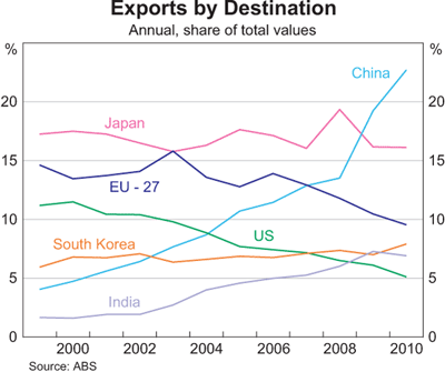
Australia's trade performance has been marked by a shift back towards resources since the early 2000s, with a remarkable shift in trade towards China over the past 10 years from under 5% to about 27% today.

This bonanza is reflected in Australia's terms of trade. 


The terms of trade is an index-measure ratio of the average price level of exports to the average price level of imports. It effectively reflects the capacity of a given quantity of exports to pay for a given quantity of imports, and provides an important indication of the strengths and weaknesses of the economic structure. A rising or falling terms of trade indicates the possibility of improving or declining living standards, because if what we sell earns relatively more than what we buy, we will be relatively wealthier. Because the terms of trade is a ratio, increases can be a result of export prices increasing at a greater rate than import prices, or export prices increasing while import prices are declining, or export prices declining at a slower rate than import prices. Of course, a rising terms of trade doesn’t stop us from buying more things than we sell, which we have made a habit of for much of our history! Improvements in the terms of trade are not reflected in GDP figures, but improvements do contribute significantly to increases in national disposable income.
 
Most commentators now think that the terms of trade has peaked and this appears more clearly in commodity prices. The terms of trade has provided a big income boost to Australia, which is not directly measured in GDP growth figures, but obviously higher income eventually has an impact on growth. Alongside the paying off of debt and the end to the effective increase in real income that comes from a higher exchange rate and lower import prices, these factors makes for a less favourable outlook for Australians over the coming year.


Note the rapid ascent of China as a share of the total and the less dramatic, but still significant growth of India's share. Compare this to the decline of the EU and US shares.


The increase in the volume of bulk commodity exports is a major factor, although the major influence on income has been the increase in prices rather than the increase in volumes.


One of the consequences of the resources boom has been an amazing growth in the level of mining investment. Given that Australia's mining sector is 80 per cent foreign owned (according to the RBA), much of this investment comes from overseas and much of the profit (eventually) also goes overseas. This negative impact on the current account deficit is offset by the positive impact of increased resource exports.

Remember that current account deficits (CADs) can be viewed in two ways (see here for explanation). While both are correct, how commentators measure them is sometimes indicative of ideological proclivities or agendas. For those worried that Australia doesn't generally export enough to cover its imports, the current account deficit is seen as the trade deficit plus the income deficit, which measures the balance of interest and dividend payments away from Australia. The mining sector is a case in point. Given that it is 80 per cent foreign owned a good deal of profits (dividends) flow out of the country. Also give that Australia has a huge foreign (private) debt, a lot of interest payments must be made to foreigners. In this interpretation of the CAD, the solution is to increase exports and cut foreign borrowing. The formula for this version is:  

CA = X - M + NY + NCT

X = Exports of goods and services
M = Imports of goods and services
NY = Net income abroad
NCT = Net current transfers

Remember that the current account can be a CAS i.e. a current account surplus. For the world as a whole deficits and surpluses must match unless we start trading with another planet. See here for further explanation.


The other way of viewing the CAD is to see it as the difference between saving and investment. This is the way most economists, especially Treasury and the RBA prefer to view the CAD because it is an accounting identity. Now obviously the two formulae can be reconciled, but I won't bore you with the details here. 

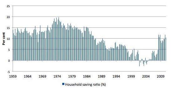
The CAD = Saving - investment approach is also preferred as an explanation because it correctly implies that Australia's CAD is driven by high investment in the mining sector, rather than low saving. Indeed Australian saving has returned to more normal levels since the GFC after a period of negative saving. 


This is from the latest ABS quarterly accounts. 


A longer term view is provided by Bill Mitchell, which shows that saving patterns are simply returning to earlier levels. 


Now if saving increases, this should mean that more Australian investment can be funded domestically, but we are currently going through the biggest mining investment boom in our history. (What is most interesting about this boom is that there is both a massive terms of trade boom and a massive investment boom at the same time). 


The following graph from RBA Deputy Governor Philip Lowe shows just how big is that investment surge.


As a consequence it is not surprising that Australia's foreign financial liabilities remain high.


Monday, August 15, 2011

Structural Change in the Australian Economy

While this might seem like a boring topic, it's probably one of the most important medium to long term economic issues facing us as Australians. 

I have recently written a piece for APO, called Structural Shenanigans in the Australian Economy. The APO  is the best source of information on Australian policy issues. It is run by Peter Browne from Swinburne, who given the amount of work he does must never sleep!

Click on the link above if you want a read or paste this into your browser http://www.apo.org.au/commentary/structural-shenanigans-australian-economy ...

Wednesday, June 15, 2011

The Economic Structure Debate


The RBA Governor Glenn Stevens made a speech in Brisbane today, basically arguing that virtually all of us benefit from the mining boom and that we better get ready for interest rate increases!

The first is that the impact of the resources sector expansion does get spread around, in more ways than might immediately be apparent. Obviously mining employs only a small share of the workforce directly – less than 2 per cent. But to produce a dollar of revenue, companies spend about 40 cents on acquiring non labour intermediate inputs, primarily from the domestic sector. Apart from the direct physical inputs, there are effects on utilities, transport, business services such as engineering, accounting, legal, exploration and other industries. It is noteworthy that a number of these areas are growing quickly at present.
Once the costs of producing the output and other factors – such as taxes – are taken into account, the remaining revenue is distributed to shareholders or retained. While a significant proportion of the earnings distributed goes offshore, local shareholders also benefit. In fact, most of us are shareholders in the mining industry through our superannuation schemes. We don't get this income directly to spend now – it is in our superannuation. Nonetheless, it is genuine income and a genuine increase in wealth.
A good proportion of the earnings retained by companies is used to fund a further build up of physical investment, which imparts demand to construction and manufacturing. Based on the industry liaison the Bank has done, around half – give or take – of the demand generated by these projects is typically filled locally, though, of course, this amount varies with the nature and details of any specific project.
So there are effects that spill over, even though it is not always easy to spot them. In the end the combination of the resources sector strength and all the other factors at work in the economy has, to date, produced a national rate of unemployment of around 5 per cent, and in Queensland only a bit over 5 per cent. There are regional variations in unemployment rates, but at this point these look comparable to what has been seen at most times in the past 10 years – a period that has seen both lower average unemployment rates and lower variation in unemployment rates than the preceding decade.
While it is this section of the speech that will attract attention, I'm more interested in his arguments about economic structure. Currently there is an important debate going on about the nature of the current boom and whether it will be sustained or not. In other words, will Australia's income continue to be boosted by Chinese (and general Asian) demand for our resources long into the future or will this boom like all others in Australian history be followed by a bust.

The most important statistical measure of this is the terms of trade discussed regularly on this blog. See Boom, Boom, Boom and Keep on Booming.

Right now Australia's terms of trade  is the highest it's been (on a 5 year average basis) since the Gold Rushes of the nineteenth century. So really it's at the highest level ever for Australia as a Federation. The purple trend line provides a good indicator for why many Australian policy-makers thought we were in deep trouble in the 1980s and 1990s because the things we were selling were declining in value and the things we were buying were increasing in value. Since then as the yellow line makes clear the opposite has occurred although most of the steep ascent is due to increasing prices for the things we sell, particularly iron ore and coal.
Stevens argues that there are two components to the China boom - cyclical and structural:
[T]he industry make-up of our economy is continually changing. While this is often a slow process – almost imperceptible in most years – these shifts have been significant over time. There is little doubt that trade-exposed manufacturing firms not linked to the resources sector are facing tough conditions at present. But many people might be surprised to learn that the peak in manufacturing's share of Australia's GDP was in the late 1950s – more than five decades ago. Its fastest rate of relative decline, so far, was probably in the second half of the 1970s. On the other hand ‘business services’ – including things such as accountancy, legal and numerous other services – have grown fairly steadily and now are credited with more than twice the share of GDP of manufacturing. Several of these sectors are being boosted by the flow-on effects of the resources boom at present.
As for the mining sector itself, its share of GDP has tended to rise since the late 1960s, having been quite low in the mid 20th century. But in 2010, the mining sector's share of GDP was still only about the same as it was in 1910. It will surely increase noticeably over the next five years, though will remain much smaller than it was in the gold rush era.
Again, none of this is to deny that there are differences in performance by industry and region. It is simply to give some perspective on what we see.
The point about long term shifts reminds us to look beyond the immediate conjuncture, and to think about the magnitude of the event through which we are living. For a good part of the change in our terms of trade is a manifestation of a large and persistent change in global relative prices. Let me be clear here: there is a cyclical dimension to the China story, and it is important that we remember that. But there is also a structural dimension. And the associated change in relative prices constitutes a force for significant structural change in the economy. I think we have all only begun to grasp its implications relatively recently.
One of the major ways that the mining boom affects economic structure is through the exchange rate. A higher dollar is great for travelling overseas, but not so great for Australian non-resource exporters (including the domestic tourism and education industries) or import competing industries.
For as well as conveying a rise in purchasing power to consumers, the high exchange rate is exerting a powerful force for structural change. I think we are seeing this in the retail sector. The rapid growth of internet commerce – from a very small base – has been the topic of considerable discussion. This was bound to happen anyway with technology. But with the higher Australian dollar, the component of the retail ‘product’ that is added in Australia – the local distribution and retailing overheads that are required to provide the retail ‘experience’ – has become both much more visible, and much higher relative to the production cost of the good itself. So the incentive for the consumer to avoid those overhead costs has increased quite noticeably. The retail sector is therefore under pressure to reduce those costs. 
Finally, Stevens correctly reminds us that the problems of structural change that we face are better than the problems of many other advanced economies where unemployment is high and growth anaemic. While we might complain about a 2 speed economy, it's much better than a no-speed economy!


Sunday, February 6, 2011

The Australian Economy: A Deficit of Long-Term Thinking?

The flood levy has caused most of the usual suspects on debts and deficits to come out and spruke their position, whether it's "increasing taxes is always bad" or "deficits are not really a problem for Australia". While my sympathies definitely lie with the latter rather than the former, I can't help but feel that we should have been building a rather large fiscal surplus over the past 20 years 'without a recession'.


While going into deficit was a necessary move by the Rudd government, the real question is whether the fiscal balance should have been in better shape before the crisis, given the mining boom and the long period of growth before the global financial crisis (GFC). Given Australia's recovery from the downturn and the increase in export prices the Gillard government certainly should be aiming to get a large surplus together sooner rather than later.

Being critical of the pro-deficit position is not an argument for less infrastructure spending, but for increased tax on super profits, especially in the mining sector, but perhaps also in the banking sector. Remember that Australia's mineral resources (whether you think we should be mining them or not) are non-renewable. Once they're gone, they're gone forever. They should be seen as the property of future generations as well as the present generation of Australians. Using taxes from mining profits to build infrastructure or to fund research into renewable energy sources makes sense on an inter-generational basis and would contribute to higher standards of living across the Australian population now and into the future.

If we look at GDP growth since the early 1990s it makes it even clearer that we should have built up a big surplus over time.


There have been only three crosses into contraction since the recovery from the early 1990s recession. This is a remarkable turnaround from the situation between 1974 and 1992 when we had three recessions and 2 other downturns. Australia has had a remarkable turnaround since the early 1990s from the seemingly terminal decline of the 1970s and 1980s.

The reasonable fiscal position of the federal government in 2008-09 made a big difference for Australia's ability to ride out the GFC and more importantly not suffer the public debt problems that the Europeans and Americans are now faced with.

But let's not forget the continuing problem of private debt in Australia. As the following graphs clearly show, Australia remains vulnerable to changes in international financial supply.


After a little dip during the GFC, Australians have returned to the unprecedented debt levels of 2007-08. The question that always need to be asked is just how high can debt go? The answer will have a lot to do with external conditions. In an expanding global economy with Asian flourishing, many Australians could probably push their debt out even further. But if this occurs a day of reckoning will eventually come. A growth slowdown in Asia because of a political shock or just the effects of boom and bust may slow growth in Australia causing rising unemployment, more defaults on debts and so on.

The other issue is the graph on the right, which shows the percentage of annual income paid in interest. Now if the Reserve Bank of Australia (RBA) were to increase interest rates because of inflationary fears and you can bet they will if there is even the faintest whiff of price pressure, the pressure on household finances will increase proportionally. The pain of Queensland households has helped to reduce the pain of households in the rest of Australia.
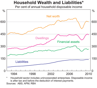
As the following graph shows, household net worth went down considerably during the GFC, while liabilities stayed relatively flat. While dwellings wealth has recovered financial assets have quite a deal to go before they get to pre-crisis levels.


The safe path would be for governments to encourage gradual deleveraging of households (and the private economy in general). Also important is a decreased reliance on foreign funding, perhaps through an increase in the super levy to 12 per cent as mooted in the Rudd government's aborted 2010 tax plans.

If we turn to inflation we can see why the RBA believes that price pressures almost got away from them before the GFC and why it now has a bias towards tightening. As the RBA governor said recently it's been rare that the RBA believes that it tightened too soon.


The high Australian dollar has also helped things on the inflation front. The following graph shows tradable and non-tradables inflation. Tradeables are those goods and services which can be exported or imported, while non tradables are not subject to export competition).


Tradable inflation has helped to keep overall inflation much lower and a higher exchange rate helps this as it makes the costs of imports lower.

There is no doubt that the Australian economy has performed remarkably since the early 1990s. This amazing overall performance (it's important to remember that not everyone has benefited) has been accentuated by the fact that the economy came through the GFC with little long-lasting damage when compared to most of Europe and the United States.

The following graphs on commodity prices make it entirely clear just how big a boost resource exports have given the Australian economy. Base metal prices have done well, but have some way to go before they match their peak, while rural goods have surpassed their previous highs.


Australia's two biggest exports iron ore and coal have increased enormously in value since a long period of stasis before 2000. China's increased steel use has been very good for Australia, but just how long prices can stay at these levels must be exercising the minds of miners in Australia. It should also be a subject of considerable concern for government in Australia given the 'untaxed' super-profits being made by our majority foreign-owned mining sector.


Overall, however, commodity prices have matched their previous peak before the GFC and as the terms of trade shows are now approaching the post-war high associated with wool demand created by the Korean War.

The terms of trade is an index-measure ratio of the average price level of exports to the average price level of imports. It effectively reflects the capacity of a given quantity of exports to pay for a given quantity of imports, and provides an important indication of the strengths and weaknesses of the economic structure. A rising or falling terms of trade indicates the possibility of improving or declining living standards, because if what we sell earns relatively more than what we buy, we will be relatively wealthier. Because the terms of trade is a ratio, increases can be a result of export prices increasing at a greater rate than import prices, or export prices increasing while import prices are declining, or export prices declining at a slower rate than import prices. Of course, a rising terms of trade doesn’t stop us from buying more things than we sell, which we have made a habit of for much of our history! Improvements in the terms of trade are not reflected in GDP figures, but improvements do contribute significantly to increases in national disposable income.

One thing that studying history has helped reinforce in my head is that good times don't last forever and that the history of the Australian economy is a history of boom and bust as the graph of the terms of trade makes clear. From the peak of 1950 until the late 1990s the terms of trade had been on a 50 year downward trend. It would be extremely optimistic to believe that we began a 50 year upward trend 10 years ago. But maybe I'm just being too negative!

All graphs from the RBA Chart Pack