Showing posts with label household debt. Show all posts

Tuesday, December 15, 2015

The Real Australian Debt Problem

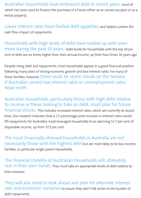
I've long argued that private debt is a major problem for Australia and could be an even bigger concern if unemployment were to rise in 2016. There are two major ways that debt burdens could become a problem in 2016-17. Firstly, if unemployment rises and secondly, if interest rates rise. It's possible that if unemployment rises then the RBA will cut rates further, but interest payments may not be possible at all if you lose your job and have committed to a loan that is too big to handle. If this happens to enough people with loans then the rate of defaults will rise, but more importantly, the number of forced sales will increase leading to further falls in house prices and an end to the wealth effect that has helped Australians keep spending despite increased indebtedness and uncertainty.

The problem with these predictions is the relevant time frame. As Rudiger Dornbusch once said "The crisis takes a much longer time coming than you think, and then it happens much faster than you would have thought". Australia has thus far avoided a negative self-reinforcing spiral where higher unemployment leads to debt defaults, housing price falls and then higher unemployment and so on. Trying to avoid such cycles is the major reason why the Rudd government decided to fiscally support the economy during 2008 and 2009. 

Leith van Onselon has written a great article over at MacroBusiness "Aussie Households Bombed on Debt". His article was based on a NATSEM report Buy Now, Pay Later: Household Debt in Australia. 

The report reveals:
“Australian average household debt is now four times what it was 27 years ago, rising from $60,000 to $245,000, reflecting an annual growth rate of 5.3 per cent above inflation and leaving our income growth rate of 1.3 per cent trailing in its wake”

Foreign debt is also high and the major contributor has been the banks increasing their call on overseas funds.


ScreenHunter_10741 Dec. 03 15.46


ScreenHunter_10740 Dec. 03 15.45

Household liabilities have been increasing at a greater rate than income - a simple function of increasing debt.


ScreenHunter_10915 Dec. 14 08.08


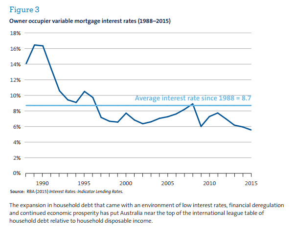
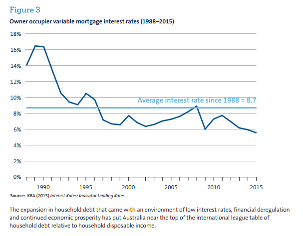
What really matters for households is the ability to service and pay down the debt. Low interest rates have helped enormously in recent years. The fact that the current level of rates is well below the average should be of some concern.


ScreenHunter_10916 Dec. 14 08.19


ScreenHunter_10917 Dec. 14 08.21


Australian asset holders have largely avoided a fall in housing prices. If prices were to fall, that gap between liabilities and income will seem larger as the assets side of the balance sheet loses value.

However, the really interesting data compares the debt situation for quintiles. This shows that the median ratio has increased for all income quintiles with the low income quintile showing the biggest increase.


Once again, however, low interest rates have made the servicing of debt easier, although the situation has worsened considerably for the lowest quintile.


NATSEM concludes with the following points:


Friday, December 11, 2015

Recent Charts

Working out what the public wants governments to do in relation to climate change is a fraught business. They did after all elect the Abbott government ... 


I'm not sure that all foreign investment is a good thing, especially in established property assets. It's not just Chinese investment in this area that is a problem.


Given the deaths at music festivals it's time for the public to have a greater understanding of drug harms. Harm minimisation should be the goal. You're never going to stop experimentation; much better to treat drug-taking as a health issue rather than a criminal one.


A series of charts on housing


The household debt situation in The Netherlands and Denmark is even worse. Be interesting to see how their debt situations unwind over coming years.


 Long-term migration down.


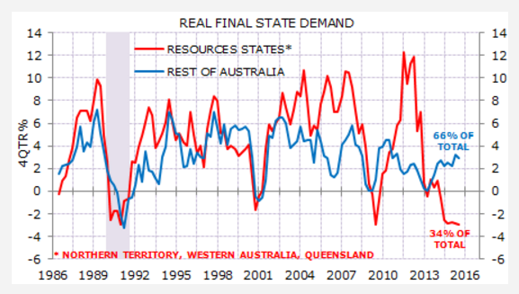
Resource states have performed poorly over recent years 


Making a significant demographic in the United States unlikely to unvote for you is stupid


Real net national disposable income is a better indicator than GDP for measuring impact on the population ... 


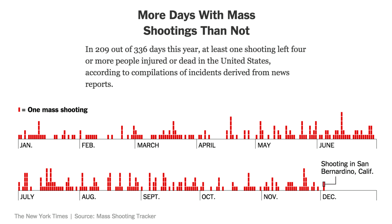
What can you say about mass shootings, except that they are only the most sensational aspect of gun deaths.  


Comparing the US to Western Europe ...


Definitely not the worst in the Americas ...


Thailand surprisingly high ...


India has lower Gini Index figure than Australia - because nearly everyone is poor, despite the growth of the middle class and the extremely wealthy.


Fewer health uninsured in the United States under ObamaCare ...


Middle income in decline in the United States


China and many other countries in Asia face demographic challenges ahead ...


Monday, November 9, 2015

Understanding the Housing Market in Australia

Greg Jericho has recently written a great article Today the great Australian dream is owning a home loan (or two). It's worth a read but I thought I'd reproduce some of the excellent charts in the article here with some comments and end with an assessment of rising household debt.

The trends in occupancy types are clear: fewer outright owners and more renters. As Jericho notes:
Twenty years ago, 71.4% of households either owned their house outright or were paying off a mortgage; now it is down to 67.2%. Had the level of home ownership stayed the same in 2013-14 there would have been around 370,000 more households who owned their home rather than renting.


Housing costs have increased rapidly since the late-1990s, but housing costs as a percentage of incomes have remained relatively stable. This highlights the significance of low interest rates and expanded incomes during the boom. When interest rates eventually rise again, expect 'real' costs to rise as well. The graph at the end of this post shows how important lower interest rates have been generally.


More Hobartians own their own home than any other capital city. Darwin has the lowest percentage of owners.


Perth leads the number of owners with a mortgage, with Brisbane the lowest.


There are more public renters in the ACT than anywhere else followed by Adelaide. Melbourne has the lowest number of households in public housing. These figures are largely related to residual and ongoing public housing policies. Public housing has been important for the ACT since its origins and the Housing Trust in South Australia has played a significant role in the rental market.  


Darwin and Brisbane have the highest percentage of private renters and Adelaide and the ACT the least.


Jericho notes the changing nature of Australian housing, particularly the increased number of bedrooms and fewer persons per house:
Perhaps linked with the rising housing costs is also the change in the size of our houses. In 2013-14, there was a record high average number of bedrooms per household at 3.14. This meant there were 1.212 persons per bedroom – just touch below the record set in 2005-06 of 1.219. 
Nearly 45% of all households had two or more bedrooms spare – but a whopping 66% of households who had paid off their mortgage had two or more spare bedrooms, around 1.8m households. 
Such a statistic certainly gives support to those who argue one reason for shortages of housing is people staying in their family home long after the children have left and perhaps long after the need for such a big house is required.
But as Bob Birrell and David McCloskey recently noted in a report called The housing affordability crisis in Sydney and Melbourne Report One: The demographic foundations
[T]here will be enormous growth in the number of households where the householder is aged 45 or more years. Most of these will be couple households as the children leave home or single person households as one or other of the partners die or move into care. This is a consequence of population ageing. The main consequence of this ageing effect will be a large increase in the number of small households aged 45 plus who will be occupying mainly detached houses  in both Sydney and Melbourne. Every extra occupancy due to ageing means one less of the stock of detached houses in Sydney and Melbourne that will be available to younger households who are seeking a detached house, whether a resident or newly arrived migrant. 
Most industry, planning and housing industry commentators on the housing crisis neglect the significance of these demographic factors. The one outcome they do acknowledge is the likely increase in one and two person households. Most assume that this increase will create a large pool of households who, though occupying detached housing, will be interested in downsizing to a unit or apartment. Some argue that this interest will contribute to an historic switch in the preference for apartment living relative to the past preference for detached houses. The evidence cited below indicates that this is a highly unlikely. 
This report argues that the neglect and misunderstanding of these demographic factors means that the housing industry leaders, commentators and planners, do not appreciate the depth and longterm nature of the housing affordability crisis in Sydney and Melbourne. Nor do they appreciate why the recent surge in apartment approvals will not solve the problem. 


Despite assertions that negative gearing benefits all income groups, investing is done mainly by the wealthy - the top 20 per cent account for 39 percent of properties.


The owner without a mortgage, however, is dominated by the lower quintiles, reflecting the fact that many owners have retired and thus have finished earning. Remember that the more investor properties there are, the more renters there will need to be as well


The owners with a mortgage category is spread as one would expect with mortgages increasing with income.


Renting is spread fairly evenly across all income levels. 


The increase in house prices has been fuelled by increased access to credit since the 1990s. Australian house prices have (so far) avoided the sort of corrections experienced in many other advanced economies, which has reinforced the popular idea that buying a house is the best investment.

While many commentators continually worry about rising public debt, I am more concerned by rising household debt. The chart below shows that debt as a percentage of income has begun to rise once again after a period of consolidation after the GFC.

Perhaps the more important graph, however, is the one on the right, which shows just how beneficial low interest rates have been. Interest payments as a percentage of income peaked in 2007. Before the GFC, the RBA was more worried about rising cost pressures than recession.

The rapid reduction in interest rates after the crisis had a significant stimulatory effect on the economy as mortgage holders suddenly had more disposable income. It would be an interesting counterfactual to think what might have happened to house prices if the GFC had not hit. Undoubtedly interest rates would have increased further as the country boomed. This then might have had a significant dampening effect on the wider economy and the housing market in particular. It is ironic that the GFC might have saved the Australian housing market, or at least delayed its day of reckoning.


Friday, October 9, 2015

House Prices Compared

The Economist has put up an interactive graphic on house prices that allows us to compare house prices, prices against average income, prices against rents and percentage changes.
THE Economist tracks the health of housing in 26 markets around the world, encompassing a population of over 3 billion. Prices are now rising in 21 of these markets at a median pace of 4.7% a year. China’s housing market is one of only five countries in our index where prices are falling, joining Singapore and a trio of euro-zone countries—France, Greece and Italy. The government has been trying to boost the market over the past ten months which is now slowly responding. 
To assess whether house prices are at sustainable levels, we use two yardsticks. One is affordability, measured by the ratio of prices to income per person after tax. The other is the case for investing in housing, based on the ratio of house prices to rents, much as stockmarket investors look at the ratio of equity prices to earnings. If these gauges are higher than their historical averages then property is deemed overvalued; if they are lower, it is undervalued. According to our measure, property is more than 30% overvalued in six of the markets we track, notably in Australia, Britain and Canada.
By comparing particular subsets of the list of countries it allows us to contextualise Australia's experience over the last 40 years.

The house price index allows us to choose a starting point going back as far as 1970 to look at changes in house prices. In an index the starting point is given a value of 100. If we go back to 1970, house prices have risen to over 9000 on the Index for South Africa and nearly 5600 in Britain and nearly 4000 in Australia. The United States, Germany and Japan's rises have been much less significant, with Japan suffering massive falls after the rises in the 1980s.


A better indication of real changes is provided as well, which makes the changes slightly more palatable. On this basis South Africa's rises in nominal terms bounce back to reality and Britain is the stand out performer with Australia also steadily rising. In real terms, prices in Japan and Germany are roughly at the same level as they were in 1970.


If we compare this same set of countries over the past 10 years, then Sweden and Canada are the stand outs.


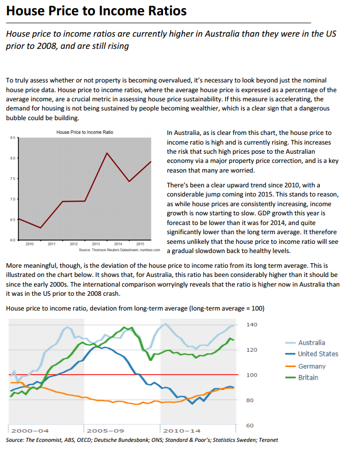
Comparing house prices against average income gives us a measure of how affordable house prices are. If average incomes have been increasing rapidly it would be surprising if house prices didn't increase rapidly as well. But what we see if we play with countries and dates is that houses have become significantly less affordable (overvalued) in Australia and Canada. Indeed, Australia is the standout. Japan's houses are significantly undervalued compared to the long term average of the ratio of prices to income.


Comparing house prices to rents gives us another variable to compare value. On this basis we get similar results, although Canada is now the stand out of overvaluation.


Playing with the starting date provides some interesting comparisons: Australia, Germany and Japan for example. Germany is particularly interesting for its relative stability. Ireland has had a spectacular rise and fall and is now rising again.


If we make the starting date 2007we can see how well Australia has done in comparison with many other countries, although German house prices have risen as well. Greece is a fairly bleak story. 


So what does it all mean? It means that house prices nearly everywhere have had periods of significant expansion due to increasing access to credit and greater financialisation of economies. While these are global occurrences, particular national considerations are have also been at play including regulations and incentives that encourage house speculation, such as restrictions on housing supply and negative gearing in Australia. 

According to the RBA: 
Over the past 30 years, Australian housing prices have increased on average by 7¼ per cent per year, and over the inflation-targeting period by around 7 per cent per year. However, these averages mask three distinct phases:
  • During the 1980s, annual housing price inflation was high, at nearly 10 per cent on average, but so too was general price inflation. In real terms, housing price inflation during the 1980s was relatively low, at1.4 per cent per annum compared with 4.5 per cent during the period from 1990 to the mid 2000s, and 2.5 per cent over the past decade.
  • The 1990s until the mid 2000s were marked by quite high housing price inflation, of 7.2 per cent per annum, on average, in nominal terms.
  • Annual nominal housing price inflation over the past decade was lower than either of these periods, at a little over 5 per cent on average.
The RBA contends that "housing price growth was closely associated with changes in the debt-to-income ratio over most of the 1990s until the mid 2000s". Recent rises have been closely associated with the increased role of investors.

The two variables that seem to indicate that Australian housing on average is overpriced are prices against income and prices against rent. Both have veered significantly from their long-term averages.