Greg Jericho has recently written a great article Today the great Australian dream is owning a home loan (or two). It's worth a read but I thought I'd reproduce some of the excellent charts in the article here with some comments and end with an assessment of rising household debt.
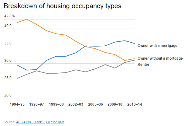
The trends in occupancy types are clear: fewer outright owners and more renters. As Jericho notes:
Housing costs have increased rapidly since the late-1990s, but housing costs as a percentage of incomes have remained relatively stable. This highlights the significance of low interest rates and expanded incomes during the boom. When interest rates eventually rise again, expect 'real' costs to rise as well. The graph at the end of this post shows how important lower interest rates have been generally.


More Hobartians own their own home than any other capital city. Darwin has the lowest percentage of owners.

Perth leads the number of owners with a mortgage, with Brisbane the lowest.


Darwin and Brisbane have the highest percentage of private renters and Adelaide and the ACT the least.

Jericho notes the changing nature of Australian housing, particularly the increased number of bedrooms and fewer persons per house:

Despite assertions that negative gearing benefits all income groups, investing is done mainly by the wealthy - the top 20 per cent account for 39 percent of properties.

The owner without a mortgage, however, is dominated by the lower quintiles, reflecting the fact that many owners have retired and thus have finished earning. Remember that the more investor properties there are, the more renters there will need to be as well

The owners with a mortgage category is spread as one would expect with mortgages increasing with income.


The increase in house prices has been fuelled by increased access to credit since the 1990s. Australian house prices have (so far) avoided the sort of corrections experienced in many other advanced economies, which has reinforced the popular idea that buying a house is the best investment.
While many commentators continually worry about rising public debt, I am more concerned by rising household debt. The chart below shows that debt as a percentage of income has begun to rise once again after a period of consolidation after the GFC.
Perhaps the more important graph, however, is the one on the right, which shows just how beneficial low interest rates have been. Interest payments as a percentage of income peaked in 2007. Before the GFC, the RBA was more worried about rising cost pressures than recession.
The rapid reduction in interest rates after the crisis had a significant stimulatory effect on the economy as mortgage holders suddenly had more disposable income. It would be an interesting counterfactual to think what might have happened to house prices if the GFC had not hit. Undoubtedly interest rates would have increased further as the country boomed. This then might have had a significant dampening effect on the wider economy and the housing market in particular. It is ironic that the GFC might have saved the Australian housing market, or at least delayed its day of reckoning.

The trends in occupancy types are clear: fewer outright owners and more renters. As Jericho notes:
Twenty years ago, 71.4% of households either owned their house outright or were paying off a mortgage; now it is down to 67.2%. Had the level of home ownership stayed the same in 2013-14 there would have been around 370,000 more households who owned their home rather than renting.

Housing costs have increased rapidly since the late-1990s, but housing costs as a percentage of incomes have remained relatively stable. This highlights the significance of low interest rates and expanded incomes during the boom. When interest rates eventually rise again, expect 'real' costs to rise as well. The graph at the end of this post shows how important lower interest rates have been generally.


More Hobartians own their own home than any other capital city. Darwin has the lowest percentage of owners.

Perth leads the number of owners with a mortgage, with Brisbane the lowest.

There are more public renters in the ACT than anywhere else followed by Adelaide. Melbourne has the lowest number of households in public housing. These figures are largely related to residual and ongoing public housing policies. Public housing has been important for the ACT since its origins and the Housing Trust in South Australia has played a significant role in the rental market.

Darwin and Brisbane have the highest percentage of private renters and Adelaide and the ACT the least.

Jericho notes the changing nature of Australian housing, particularly the increased number of bedrooms and fewer persons per house:
Perhaps linked with the rising housing costs is also the change in the size of our houses. In 2013-14, there was a record high average number of bedrooms per household at 3.14. This meant there were 1.212 persons per bedroom – just touch below the record set in 2005-06 of 1.219.
Nearly 45% of all households had two or more bedrooms spare – but a whopping 66% of households who had paid off their mortgage had two or more spare bedrooms, around 1.8m households.
Such a statistic certainly gives support to those who argue one reason for shortages of housing is people staying in their family home long after the children have left and perhaps long after the need for such a big house is required.But as Bob Birrell and David McCloskey recently noted in a report called The housing affordability crisis in Sydney and Melbourne Report One: The demographic foundations
[T]here will be enormous growth in the number of households where the householder is aged 45 or more years. Most of these will be couple households as the children leave home or single person households as one or other of the partners die or move into care. This is a consequence of population ageing. The main consequence of this ageing effect will be a large increase in the number of small households aged 45 plus who will be occupying mainly detached houses in both Sydney and Melbourne. Every extra occupancy due to ageing means one less of the stock of detached houses in Sydney and Melbourne that will be available to younger households who are seeking a detached house, whether a resident or newly arrived migrant.
Most industry, planning and housing industry commentators on the housing crisis neglect the significance of these demographic factors. The one outcome they do acknowledge is the likely increase in one and two person households. Most assume that this increase will create a large pool of households who, though occupying detached housing, will be interested in downsizing to a unit or apartment. Some argue that this interest will contribute to an historic switch in the preference for apartment living relative to the past preference for detached houses. The evidence cited below indicates that this is a highly unlikely.
This report argues that the neglect and misunderstanding of these demographic factors means that the housing industry leaders, commentators and planners, do not appreciate the depth and longterm nature of the housing affordability crisis in Sydney and Melbourne. Nor do they appreciate why the recent surge in apartment approvals will not solve the problem.

Despite assertions that negative gearing benefits all income groups, investing is done mainly by the wealthy - the top 20 per cent account for 39 percent of properties.

The owner without a mortgage, however, is dominated by the lower quintiles, reflecting the fact that many owners have retired and thus have finished earning. Remember that the more investor properties there are, the more renters there will need to be as well

The owners with a mortgage category is spread as one would expect with mortgages increasing with income.

Renting is spread fairly evenly across all income levels.

The increase in house prices has been fuelled by increased access to credit since the 1990s. Australian house prices have (so far) avoided the sort of corrections experienced in many other advanced economies, which has reinforced the popular idea that buying a house is the best investment.
While many commentators continually worry about rising public debt, I am more concerned by rising household debt. The chart below shows that debt as a percentage of income has begun to rise once again after a period of consolidation after the GFC.
Perhaps the more important graph, however, is the one on the right, which shows just how beneficial low interest rates have been. Interest payments as a percentage of income peaked in 2007. Before the GFC, the RBA was more worried about rising cost pressures than recession.
The rapid reduction in interest rates after the crisis had a significant stimulatory effect on the economy as mortgage holders suddenly had more disposable income. It would be an interesting counterfactual to think what might have happened to house prices if the GFC had not hit. Undoubtedly interest rates would have increased further as the country boomed. This then might have had a significant dampening effect on the wider economy and the housing market in particular. It is ironic that the GFC might have saved the Australian housing market, or at least delayed its day of reckoning.


