Thursday, October 27, 2011

Some interesting data on China, India (and Australia)

Those wanting a good summary of India's development, especially in comparison to China and its impact on Australia should read

"India's long-term growth potential and the implications for Australia"

by Ben Ralston, Wilson Au-Yeung and Bill Brummitt

 Some of the graphs provide are excellent.

 Chart 1: Working age population as a proportion of population


This means that India is better set up demographically than China for the future. In countries like Australia there will be more old people to support and the retirement age will no doubt push out to 70 as people generally live longer. (My heart bleeds for those Greeks who believe that shifting the retirement age beyond 55 for "arduous" jobs represents severe sacrifice)

Chart 2: Long term projections — India, China and G7


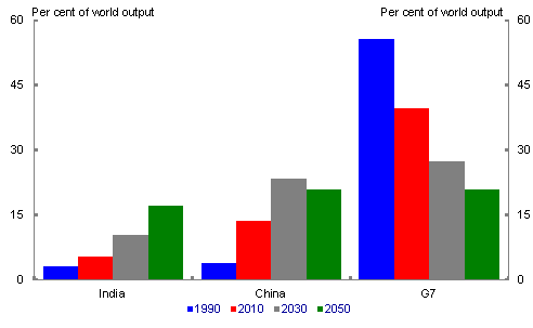
Of course much could go wrong!!

Chart 3: GDP per capita as a proportion of the US


The interesting thing about this projection is that in the 1980s it was assumed that Japan would soon match US GDP per capita, which is an important indicator of real progress.

Chart 4: Population of India and China


Both countries it seems will need more girls if there are not to be a lot of young men without girlfriends and wives!

Chart 5: Participation rates for India and China


India still has a long way to go to encourage more workers to participate in the formal work sector. Changes in regulations will probably increase the participation rate in India in the future, providing further advantages for the Indian economy.

Chart 6: Australia’s exports of education services to India

The authors report that:
Currently around 11 million Indian students are pursuing higher education — but this
represents just 11 per cent of the nation’s 17-23 year olds. The level of unmet demand
for university places runs at around 4.7 million places each year.
Government policy is directed towards increasing the Gross Enrolment Ratio — the
ratio of actual students to potential students — to 25 per cent by 2022.
To supply the necessary places, India intends to set up around 1,500 new higher
education institutions, at least one central university in each state, and 14 new
innovation universities.
The opportunities for Australian universities, whether in terms of partnering with
Indian institutions during this growth phase or attracting more Indian international
students to Australia are clear.
In terms of vocational education and training, the scope of opportunity is also
impressive. The Australian Government has identified opportunities to increase the
delivery of Australian vocational education and training (VET) qualifications in India.
At present only 2-2.5 per cent of India’s population undertakes formal VET training.
However, it is estimated that some 500 million people will require training by 2022 —
over 21 times Australia’s population. The current capacity of the Indian VET system is
around 4.3 million training places.
The challenge for India is enormous and India recognises that it cannot achieve these
goals alone.
The scale of needs in India has seen our exports of education services to India
experience roughly a 28 fold increase in dollars spent over the 15 years to 2010.32 These
exports remain at very high levels and the whole trade is now on a much more
sustainable path after the Government’s series of visa reforms.
It seems that there will be more Australian academics in India in coming years!

While the opportunities that India's growth represents to Australia are huge, the education sector shows that things can go wrong. The breakneck expansion of the sector led to many shonky operators, especially in the VET sector. The high Australian dollar has probably also had a negative effect on Australia. Why study in Australia when you can study in the US more cheaply. 

House Prices


This is from the Australian (if you want to get a story on The Australian but don't want to pay, simply put the title into google and click on the link ... this will get you the full story).

Maybe one day I might even be able to buy a house in a suburb I would want to live in!

The real issue is whether prices will stagnate at this level for a while or continue to fall.

Meanwhile falling house prices no doubt make homeowners feel poorer, even if it doesn't really matter whether your home is worth 550k rather than 600k as long as you're not selling it.

Wednesday, October 26, 2011

National Bank Just Awful

These two articles appeared in my google news alerts side by side:

"Big banks head for $24bn profit, but slowdown looms

and 

"NAB seeks right to evict renters"


The first story reported that:
National Australia Bank will begin the banks' reporting season on Thursday with a likely $5.35bn cash profit. The bank, Australia's fourth largest by market capitalisation, is expected to show the strongest revenue growth as a result of its aggressive approach in mortgages.
The second story reported that:

RENTERS face being evicted without notice when owners default on home loans if the National Australia Bank wins a Supreme Court battle against Victoria's Sheriff. ...
In a case that could have far-reaching implications for Victoria's renters, NAB has taken the Sheriff to court after it failed to evict the tenants of two Ivanhoe East properties.
The mortgagor of the properties defaulted on repayments to NAB after letting them out without the bank's knowledge, prompting it to seek repossession orders.
NAB wants the Supreme Court to force the Sheriff to evict the tenants without it needing to comply with the Residential Tenancies Act, which requires renters be given 28 days' notice.
A tenant of one of the properties, Darren Burke, said the uncertainty and stress had forced him to consider moving home.
''I've got an 84-year-old mother living with me and the last thing I need is the stress for her. She thinks we're going to be kicked out every five minutes,'' he said.
''If the owner goes belly up and can't pay their mortgage, that means the bank can come in and say to every person: 'Right, here's your eviction notice, get out!' ''
In court documents, NAB argues the Sheriff should enforce a warrant of possession on the homes without requiring the bank to go to VCAT and give the tenants notice.
But the Sheriff has refused to act on the warrant because the Tenancies Act obliges owners to give the tenants notice ''to the exclusion of any other law''.
''At the very least, there is a right [of tenants] to receive notice to vacate,'' says the Sheriff
It's probably not very often the role of Sherrif has been seen so benignly!!

No wonder the banks have a bad reputation in Australia.


Tuesday, October 25, 2011

Why is the Gillard government so timid about the mining tax?

BIS Shrapnel has recently conducted a report (see here for coverage) that contends that the mining investment boom will continue for the next 5 years with total investment reaching $375 billion.

That's a lot of money. So why do we still not have a mining tax?

One can imagine the possibility that by the time the mining tax is ready to come in, the boom will be (temporarily perhaps) over, putting pressure on the government to abandon it. This could be the case even though a profits-based tax would be better for the miners than a volume-based tax during a downturn in prices. It's certainly not better for them when profits are high, but that's the whole point. The resources are non-renewable and the profits made from selling them overseas should be more equitably shared.

We can only imagine what could have been achieved if we had had a profits-based mining tax for several years, not only in terms of productive government expenditure in infrastructure, but in the ability to reduce taxation for those industries facing difficulties in the patchwork economy.


Warnings by the mining sector about the negative impact of the carbon tax and the potential mining tax on future investment are bunkum.

Tuesday, October 18, 2011

Why Japanese Debt is better than Greek Debt ... and Australia Compared

A lot of guff is written about debt. Part of the problem stems from a failure to distinguish between types of debt - between public and private debt, between foreign and domestic debt and between gross and net debt. I've written about these issues before here and here.

The graph from The Economist shows clearly why the public debt situation in Japan is less worrying than Greece's, despite Greece having a considerably lower level of gross debt.

Gross debt is the preferred focus of news media because it sounds more extreme.


What matters is net debt and how much debt is owed to foreigners.

The problem for Greece (and Italy, Ireland, Portugal and Spain ... perhaps even France) is that they are stuck with the Euro, which means they can't devalue or inflate their debt levels down. This makes bondholders worried that the eventual outcome will be the departure of some countries from the Euro or default. The two options may of course be related.

Imagine the scenario of Greece going back to the drachma or Spain to the peseta. Both currencies would suffer a large devaluation against the Euro and the dollar - the currencies in which a large part of their debt is denominated in. So while they would get a competitive boost from the devaluation, their debt would expand in local currency terms.

There are no easy options for Europe at the moment.

Interesting to note that a majority of US debt is held domestically. Despite the US debt to China being such a big issue and an indicator of US weakness in relation to China, US debt is more of a problem for China than the US.

Eventually Japan too will have to face up to the issue of just how much debt can you get yourself into before it's unsustainable.

Australia's public debt situation is remarkable by comparison as the following graphs from The Final Budget Outcome for 2010-11 released recently.  Neverthless, as I recently argued in "Structural Shenanigans in the Australian Economy" for Australian Policy Online, Australia's private foreign debt and household debt is still a major issue for the economy.


Friday, October 14, 2011

Basic Economics for Australia

This is the best article I have read on the economics of recent policy changes for quite some time. All students (and perhaps Coalition politicians) should read it.

Jessica Irvine
Economics by book not for Abbott
October 14, 2011


Economics textbooks are hefty objects. Many a kinked neck and curved spine have resulted from children being forced to lug such weighty tomes between school and home.
Whether many students manage to read and absorb the often turgid contents of such books remains an open question.
But the Prime Minister, Julia Gillard, and the Treasurer, Wayne Swan, have proven diligent students. Many of the hallmark economic policies of this Labor government - pricing carbon, the mining tax, fiscal stimulus and even efforts to cap middle-class welfare - could be torn straight from the pages of your typical HSC economics textbook.
Forcing big polluters to pay for the pollution they emit is economics 101. To an economist's mind, pollution is the ultimate example of an ''externality''. Externalities arise when the total costs or benefits of an activity are not borne entirely by the producer of that activity, but are imposed, in part, upon the rest of society. This can be a good thing. Investments in new technologies can produce ''positive externalities'', or ''technology spillovers'', if the resulting new technology is of potentially wider application.
That is why economists often support government subsidies for research and development. Without such subsidies, the market would produce less investment in this new technology than would be socially optimal. Any economics textbook will tell you such externalities are a case of market failure, where the level of activity produced by the free market is not socially optimal. Society is better off when governments intervene to promote the activities that generate positive externalities, or to discourage activities with negative externalities.
When your neighbour strikes up her lawnmower at 7am on a Saturday, no doubt she is doing it because it is the best use of her time. But her actions create a negative externality - noise - which affects all within earshot. The neighbourhood as a whole would be better off - enjoying more sleep and harmony - if she did not engage in such industrious activity so early in the morning. That is why local councils commonly impose curfews on the use of loud machinery, to control the noise externality.
Pollution is the textbook example of such a negative externality. If producers are not forced to pay for the pollution they emit as part of their production process, they tend to do more of it than would be socially optimal. Pollution imposes a cost on the rest of society - through global warming, increased severe weather events and drought - that is not borne by the producers themselves. Making polluters pay, even if they pass some of this cost on to consumers, corrects for this externality and gives them an incentive to pollute less.
The economic theory behind the government's proposed minerals resource rent tax is similarly standard economics fare. Economists are always looking for ways to raise tax in a way that interferes with economic activity as little as possible. Land, being immoveable, is the ultimate example of something good to tax - land can't move to avoid the tax. Natural resources are also largely immoveable, making them an obvious target for taxation.
But instead of setting an arbitrary annual tax based on the volume of mineral extraction - like state mining royalties - economists consider it far more efficient to tax natural resource producers as a percentage of their profits. In particular, it makes sense to tax mining companies on their ''above normal profits'', that is, not just the reasonable rate of return required to tempt them into extracting resources in the first place, but the return they receive in excess of that due to the scarcity of the resource and the monopoly power they have over production at a particular mine. This is the essence of the mining tax.
The government's multibillion-dollar stimulus program unleashed at the beginning of the global financial crisis was also by the book. It is no overstatement to say it represents perhaps the finest example of Keynesian fiscal stimulus employed by any country to date. With private demand in retreat, the government stepped forward quickly with public demand to prop up growth and employment, helping Australia to avoid recession. Crucially, the stimulus was designed to be temporary, so when the economy was on the mend the withdrawal of stimulus ensured government policy was Keynesian on the upside, too.
Carbon tax, mining tax and fiscal stimulus: a holy trinity of good economic policies that, instead of earning Labor a reputation for fine economic management, have somehow bred only discontent and fear.
Because while Labor has proved a good economics student, it has proved a woeful economics teacher, failing to impress upon voters the important and prudent nature of its reforms.
It has no doubt faced fierce opposition in building the case for good economic policy. Labor swallowed the economics textbook whole, but choked politically in the process.
But in Tony Abbott's hands, the economic textbook seems little more than a handy blunt object with which to whack one's opposition. The Opposition Leader appears hell-bent on styling himself as some sort of economic Antichrist.
Where Labor seeks a market-based solution to the problem of climate change, Abbott wants a multibillion-dollar system of grants, where the government will pick winners for funding to reduce emissions.
Where Labor seeks a minerals resource rent tax in line with Ken Henry's recommendation, Abbott wants to axe the tax, meaning a return to inefficient state mining royalties.

Abbott lampooned the government's fiscal stimulus to such a degree that it is not at all clear he would attempt any such action should global economic conditions deteriorate.
I was at the lunch earlier this year at Melbourne University when Abbott slapped down a roomful (outdoor tentful, actually) of Australia's most respected economists for their advocacy of a price on carbon. ''Maybe that's a comment on the quality of our economists,'' the Rhodes scholar and Sydney University economics graduate chided his audience.
Certainly, the comment raised some eyebrows. But mostly, the reaction seemed one of ''well, he would say that wouldn't he?''
Tony Abbott has made it abundantly clear that the arguments set out in economists' textbooks do not impress or interest him.
Read more: http://www.smh.com.au/opinion/politics/economics-by-book-not-for-abbott-20111013-1ln1b.html#ixzz1ajjutopH

Surprise, surprise ... the rich have got richer

Today the ABS reported that
Richest households 15% richer
The wealthiest 20% of households have increased their average net worth 15% since 2005-06 (CPI adjusted), while the poorest 20% of households saw only a 4% rise, according to the Australian Bureau of Statistics (ABS).
These wealthy households had an average net worth of $2.2 million per household, and accounted for around two-thirds of total household wealth. The poorest 20% of households had an average net worth of $32,000 per household, which accounted for 1% of total household wealth.
The average wealth of an Australian household in 2009-10 was $720,000, up 14% (CPI adjusted) since 2005-06.
There were differences in the average levels of wealth between the states and territories. Average net worth in Queensland, South Australia and Tasmania were below the national average.
Household wealth was more concentrated in metropolitan areas. The average net worth of households located in capital cities was $772,000 as compared with $629,000 in areas outside of capital cities.
Owner-occupied homes were the main asset held by Australians. Mortgages on them were the main liability, with over two-thirds of Australian households owning their own home either outright or with a mortgage.
For households who owned their home outright (2.7 million households), the average value of the home was $541,000. For those households with a mortgage on their home (3 million households), the average value of the home was $521,000, and the average mortgage outstanding was $188,000, giving a net home equity of $333,000.
One in five households owned property other than their own home, including holiday homes and rental properties.
Superannuation was the main financial asset held by households, with three-quarters of all households having some superannuation assets.
For households with superannuation, the average value of their superannuation was $154,000, but for half of these, the value was less than $60,000.

More information can be found in Household Wealth and Wealth Distribution, Australia, 2005-06 (cat. no. 6554.0).
Other interesting stats

"Sixty-nine percent of households own their own home either outright or with a mortgage"

It also notes the important distinction between means and medians
DISTRIBUTION OF WEALTH


While the mean household net worth of all households in Australia in 2009-10 was $720,000, the median (i.e. the mid-point when all households are ranked in ascending order of net worth) was substantially lower at $426,000 (table 7). This difference reflects the asymmetric distribution of wealth between households, where a relatively small proportion of households had high net worth and a relatively large number of households had low net worth, as illustrated in the following frequency distribution graph (S1).

As shown in table 2, over 1.2 million households (16%) had net worth less than $50,000, with 77,000 of these households having negative net worth (1% of all households).

S1. DISTRIBUTION OF HOUSEHOLD NET WORTH, 2009-10


Diagram: S1. DISTRIBUTION OF HOUSEHOLD NET WORTH, 2009–10


Another measure of wealth distribution is provided by the net worth shares of groups of households at different points in the wealth distribution. The following graph (S2) shows that, in 2009-10, households in the highest net worth quintile held 62% of the total net worth of all households, while a further 20% was held by households in the 4th quintile. By comparison, the lowest three quintiles held, in total, 18% of total net worth.
S2. Net worth, Percentage share of total
Graph: S2. Net worth, Percentage share of total


It also notes the distinctions between WEALTH and INCOME [for example while I might have a reasonable income, I have no wealth :-( ]
Wealth is distributed between households somewhat differently to income. While the 20% of households comprising the lowest net worth quintile accounted for only 1% of total household net worth, they accounted for 12% of total gross household income. The 20% of households comprising the lowest gross household income quintile accounted for 4% of total gross household income but 13% of total net worth (table S4).
The differences in the distribution of wealth and income partly reflect the common pattern of wealth being accumulated during a person's working life and then being utilised during retirement. Therefore many households with relatively low wealth have relatively high income, especially if they are younger households. Conversely older households may have accumulated relatively high net worth over their lifetimes, but have relatively low income in their retirement.
In addition, some households have low or even negative incomes due to business or investment losses, but still have relatively high levels of net worth. ...
The lowest equivalised income decile had a higher mean equivalised net worth ($309,000) than the second to fifth equivalised income deciles. Average equivalised net worth of households in the highest (tenth) income decile was more than double that of households in the ninth income decile ($1,158,000 and $477,000 respectively).
Of course the stage of life you are in matters considerably as well
Life cycle stages


A typical life cycle includes childhood, early adulthood and the forming and maturing of families. ...
Of the selected life cycle groups, the group with the highest mean household net worth was couple only, reference person aged 55 to 64 ($1,317,000). Many of these people are either nearing the end of their time in the labour force or have recently retired, that is, they are at the end of the main wealth accumulation period. People over 65 had lower net worth on average ($1,111,000 for couples and $572,000 for lone persons), at least partly reflecting a run-down of assets to support consumption in retirement. These older cohorts may also have had less opportunity for capital accumulation in earlier decades, for example, because women had lower participation rates in the paid work force. 
Lone persons aged under 35 had the lowest mean household net worth, at $151,000. The mean household net worth of couple only households with a reference person aged under 35 was $237,000 (or $119,000 per person). These couple only households had almost twice the level of mean gross household income of the young lone person household ($2,128 per week compared with $1,152 per week). The mean age of the household reference person in both household types was 28, that is, they had had the same amount of time on average to accumulate wealth.
One parent, one family households with dependent children had a mean net worth of $276,000, compared to $827,000 for couple family households with dependent children. Differences in relative age did not contribute significantly to this substantial difference in net worth, since the average age of parent was 41 years for the one parent families and 42 years for couple families. Home ownership for the one parent family households was about half that of the couple family households (40% and 77% respectively)
Interesting stuff.